Billions of websites compete to rank on Google and other search engines.
One of the most crucial ranking factors that Google considers is user experience (UX).
Sites offering visitors good content and an excellent overall experience rank higher in the search engines.
User experience and SEO have a positive link that digital marketers should understand.
You may have an optimised website, but if it fails on UX, your competitors might win the organic ranking battle.
Therefore, your website should always offer an exceptional user experience. Good user experience compliments SEO in many ways and powers your site to rank higher organically.
This article will help you understand the relationship between UX design and SEO and share the best tips to improve your UX design to pump up your search engine optimization strategy.
Let’s begin!
What is SEO?
Search engine optimization or SEO is the process of ranking a web page at the top of search engine results for relevant keywords so that people can see it.
The main objective of SEO is to increase the quantity and quality of organic traffic coming to a website. When a web page appears in an organic search for specific keywords, more people are likely to click and visit the page leading to more conversions.
What is UX?
User experience or UX includes all the techniques you employ to provide site visitors with good content and overall experience.
An excellent user experience increases user dwell time and conversion rate.
When you focus on UX, you take steps to optimise how your site visitors interact with it. The idea is to solve all their pain points by making it easier for them to find answers to their questions.
A good UX should improve engagement and help users find whatever they want when they visit a page.
User experience also affects the different engagement metrics that Google uses to rank a user-friendly website.
When you start applying the top UX enhancement tactics, you will start seeing improvements in your website rankings, traffic, and conversion rates.
Why is UX Important For SEO?
User experience covers how the user finds your website and how they interact with it.
It includes UX and how visitors behave when they arrive on your site.
The main objective of UX optimization is to rank your site on the first page of Google to bring in more traffic and also to increase the current conversion rate.
User experience optimization is a part of the TOFU (Top of the funnel), MOFU (Middle of the funnel), and BOFU (Bottom of the funnel) sales funnels.
In the case of an e-commerce website, factors such as customer acquisition and user retention depend significantly on UX.
No SEO campaign is complete without actively converting the site visitors. When you focus mostly on UX, your site visitors get what they are looking for.
Here are the top reasons why you should invest in improving UX on your website:
- Boosts your SEO score and helps your site ranking higher in the search engines.
- Helps to make your website or online store stand out from the rest so that you improve your branding.
- Improves conversion rate to maximise sales.
- Helps with user retention and keeps visitors on the site for long.
- Aims to provide positive experiences to keep the users loyal to the brand.
- Helps in building trust in your brand, product, or service so that you are able to establish a longstanding relationship with your customers.
User experience is about providing the information your customers need and making them happy. It changes how prospects and existing customers perceive your brand.
When you improve on UX, you create a more personalised experience for users, which means you can retain them for a long time.
What is the Connection between UX and SEO?
The first step to launching a UX and SEO strategy is to understand how users perceive and interact with your site. There are a lot of factors, such as page speed, URL structure, responsiveness, mobile friendliness, and menu design, that you should consider.
A lot of things you do on your website to improve UX also improves SEO. Beginners in digital marketing might still not know how these two relate.
Here are some of the ways UX and SEO work closely:
1- Backlinks
When users click on your site, read the page, and like the content, they are most likely to recommend it. They do this by adding a link to your website from their websites. This way, UX improves the number of backlinks to your site.
Besides, when users share links to your page with their audience because you provide better UX, you gain more web traffic.
Ideally, when you have more quality backlinks to your website, you send a message to Google that your site offers value to users. Google will award you by ranking your website at the top of search results for relevant keywords.
2- Mobile Friendliness
Most users spend 70% of their online time on mobile devices. Additionally, at least 74% of users agree that they are most likely to return to a website if it’s mobile-friendly.
Therefore, making your website mobile-friendly and understanding mobile SEO is one of the top ways to rank higher on Google.
As of July 2019, Google started using mobile-first indexing for all sites by default, meaning Google only uses the mobile versions of the content you publish on your website.
Therefore, if your website is not mobile-friendly, it may not have a position on the first page of search results.
3- Page Speed
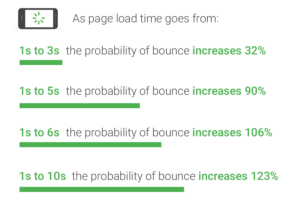
Most internet users are impatient, always looking for fast solutions to their problems. With more than 80% of users expecting web pages to load in less than 3-4 seconds, it is imperative to work on your website speed.
Source: hobo-web.co.uk
When you improve page loading speed, you enhance user experience on your site because people are able to read the primary content on your page faster.
Google looks into page speed when ranking your website. Therefore, when you improve page speed, you also improve SEO and UX. You can use the PageSpeed Insights tool from Google to measure how fast your page is loading and get instant recommendations to boost site speed.

4- Bounce Rate
Most elements that improve UX on your site will automatically improve user dwell time. For instance, if you have swift navigation on your site, you make it easy for visitors to find the content they are looking for on your site.
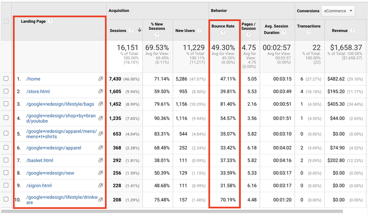
Moreover, better UX leads to a low bounce rate. A bounce rate is a measure of how relevant and user-friendly your site is for the users. A high bounce rate means people bounce back to other websites after clicking on your site. This is a clear signal to Google that something is wrong with your site and people do not like it.
You can see the bounce rates of all the pages on your site using Google Analytics.
Source: hotjar.com
When you improve user experience, the bounce rate is automatically lowered, leading to higher conversions and improved SEO.
5- Pages Per Session
Pages per session is the number of pages on your website that a user views per session. Most users will begin a session when they navigate a website. A page session will normally end after at least 30 minutes of users being inactive or exiting the site.
Pages per session is a useful metric in determining users’ behavior within a website. Having a high page per session simply shows that you offer valuable content to your users.
It also means your site is easy to navigate by users, which is one of the user engagement metrics search engines rely on to measure the user-friendliness of a website.
8 Tips To Balance SEO and User Experience (UX)
As we have seen in the previous section, SEO and UX go hand in hand. The relationship between UX and SEO can significantly impact a company’s profit, reputation, and leads.
Since SEO and UX have a close and strong connection, you can easily get one to work for the other. One simple UX best practice, such as working on page speed, can significantly impact how a website ranks on organic search.
Here are some of the top UX/SEO best practices to rank your website higher in the search results.
1- Conduct UX and SEO Audit
If you want to know where you should start when improving SEO and UX, you should first do a website audit. When you conduct a site audit, you can find out how users interact with your website.
You should know your business goals and why users are visiting your website. Having a clear audience persona is crucial to design your website according to the preferences of your users.
Once you understand the user objectives, you should leverage the power of SEO and UX analytics tools such as SEMrush, Ahrefs, Crazy Egg, and KissMetrics to understand what the users want.
Heat Mapping tools like CrazyEgg will show you where the users are clicking on your site. With this information, you can keep the CTA in a place that receives the maximum clicks.
Here is an example of a heatmap in action:

Source: crazyegg.com
Similarly, tools like SEMrush will show you the queries that are bringing in traffic to your site. It will also show you the landing pages that get the maximum traffic.
You can also check the top landing pages and their bounce rates using Google Analytics.
With this data, you can take steps to optimise the UX to further improve your bounce rate and conversions.
You should pay special attention to the colour, fonts, and pictures used on your site. Here are some tips to follow:
- Colour: Choose colours that represent the company’s personality and resonate well with users. Know all the colours and what they mean to users before using them on your website.
- Fonts: Fonts are important on a site because they evoke emotions. Choose fonts based on the feelings you want to convey to your audience.
- Pictures and graphics: Images are worth more than text. With relevant images on your site, you can easily improve user experience.
2- Improve Content Quality
When it comes to working on SEO and UX, content is still king. Most marketers will say that delivering quality content alone is enough to drive more users to your website and improve user experience. However, when creating content for your website, you should know how to present the content.
While most users expect valuable content from your site, presentation is important. Therefore, the key to improving UX is to ensure your content is brief, on point, and valuable.
Keeping your content too short can affect your ranking on search engines. You should focus on having ample content on each page and present it in a more interactive manner for users to easily understand the information.
When you create content for your website, you should keep it between 2000-2500 words.
Here are some tips to make your content user-friendly:
- Divide the content into proper subheadings while using proper H1-H6 html tags.
- Make the content interactive by adding video and images.
- Add relevant internal and external links to improve navigation.
- Check your content using grammar-checking tools, such as Grammarly.
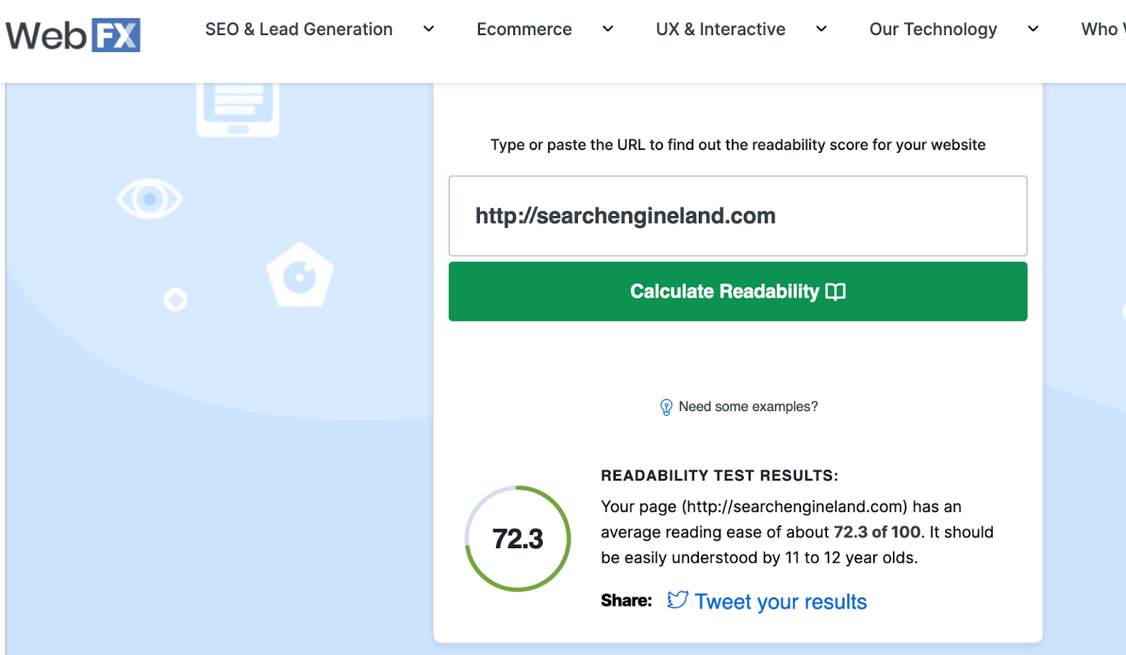
- Find out the readability score of your content using tools such as the Readability Test tool. A readability score tells you the level of education someone needs to easily read a piece of text.
- Use shorter paragraphs to make the content easy to digest.
- Add an FAQ section that answers the top questions related to the primary topic.
- Create a unique selling point so that people know what to do next after reading your content.
- Provide original and in-depth information.
- Group related content together and create proper parent pages. Link to child pages from the parent page. Websites without parent pages often appear flat and confusing to search engine crawlers.
- Use social sharing buttons to make it easier for users to share your content.
- Write catchy titles. You can use the Coschedule Headline Analyzer to analyse the title score. The tool will help you gauge the type of emotion your headline conveys.
- Add accurate title tags and meta descriptions to help the search engines understand your content.
- Leverage SEO copywriting guidelines to make your content engaging and SEO-friendly.
- Spy on your competitors and try to create 10x better content than them.
3 – Improve Page Load Time
Page speed is one of the 200 ranking factors that Google uses. Ideally, your web pages should take less than five seconds to load if you want to keep a visitor on your site for long.
The latest page experience update has made it imperative for sites to work on page loading time for better ranking.
A second delay in load time affects the number of page views you get. When your website takes longer to load, it affects the overall user experience. In the long run, this will affect your conversion rate and visitor retention.
Here are some of the tips you can use to improve website speed:
- Apply website caching on your website.
- Choose a reliable hosting plan for your site.
- Use lazy loading.
- Eliminate all the auto-play multimedia formats.
- Compress large-size images.
- Invest in a quality content delivery network (CDN).
- Avoid inline JavaScript and CSS files.
- Reduce the number of HTTP requests.
- Avoid redirects and set up G-Zip encoding.
- Streamline your HTML code and clean up the media library.
- Reduce the number of plugins on your site.
- Use Expires headers.
If you want to improve your website speed, you should make sure your site is properly optimised.
Minify script files on your website until they are needed.
These tips will allow your website to load fast and engage your audience more.
4- Choose a Mobile Responsive Design
Choosing a responsive website design is important to boost user experience.
Moreover, when more than 60% of web traffic comes from mobile devices, you must consider having a responsive theme when you set up your site. With a responsive theme, you keep UX positive and consistent across all devices.
Set the viewport because it will help the content to adjust based on the viewing device width.
Here is an example code:
<!DOCTYPE html> <html lang=”en”>
<head>
…
<meta name=”viewport” content=”width=device-width, initial-scale=1″> …
</head>
…
For more advanced designs, you can use CSS media queries.
Media queries are simple filters that can be applied to CSS styles. Adding them will make it easy to change styles based on the types of the device rendering the content.
Here is an example code:
<!DOCTYPE html> <html lang=”en”>
<head>
…
<link rel=”stylesheet” href=”print.css” media=”print”> …
</head>
…
5- Keep the Website Architecture Simple
Site architecture is important to rank at the top and improve user experience.
Website architecture is the hierarchical structure of the pages of your website and is reflected through internal linking. Your website hierarchy should follow a logical yet straightforward pattern.
With a good website architecture, search engine crawlers can easily find and index web pages. An intelligent site architecture helps to pass the link equity from low to high-authority pages on your site, making your site more visible.
When you have proper site architecture, you influence your users. Most users use the sitemap and navigation menu to find what they are looking for on your website. Therefore, you should make your site architecture simple and easy to follow.
Here are the tips to optimise your website architecture:
- Ensure pages are less than three clicks away from the homepage.
- Use catchy CTAs to direct users.
- Improve site navigation by adding a search feature.
- Organise all the web pages on your site in an intuitive way.
- Optimise your site URLs by using easy-to-remember, relevant, and shorter URLs.
- Include keywords in URLs and separate words with hyphens.
- Avoid using numbers in URLs and keep category names consistent across URLs and navigation menus.
- Create and submit an XML sitemap.
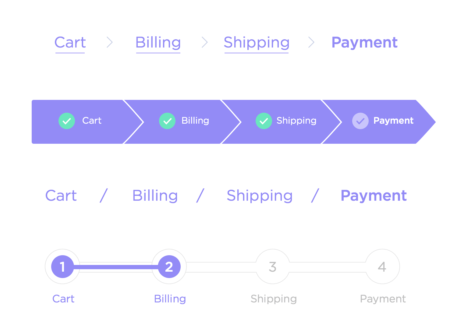
- Use breadcrumb navigation for easier crawlability. Here is an example of a breadcrumb navigation:
Source: justinmind.com
- Use proper canonical tags to avoid content duplicacy.
- Add site search because search functionality is essential to make your site as easy to navigate as possible.
- Keep your code clean, and find potentially harmful functions that can slow down the page speed or user experience.
6- Perform Keyword Research
A keyword is a search phrase that users enter on search engines when looking for your business.
When doing keyword research, you should be able to get the right long-tail keywords.
A long tail keyword should combine at least three search phrases. These keywords help you narrow your focus to reach the right audience and increase your conversion rate.
When you choose the most appropriate keywords, only the right customers will stop by and click on your website, earning you more quality leads.
Also, you should always avoid keyword stuffing as it leads to penalties. Keyword stuffing is when you sprinkle a lot of keywords on your content unnaturally.
Ideally, you should insert relevant keywords in your content naturally. When you have forced keywords on your content, you make your blogs irrelevant to readers.
When doing keyword research and writing content, you should focus on user intent.
You can use keyword research tools like SEMrush or Ahrefs to find the best keywords to target your audience. You can also use these tools to find the keywords your competitors are using to bring organic traffic to their sites.
You should use primary and secondary keywords in your page content. Besides, you should use LSI variations of your primary keyword several times in your content.
7- Employ UX Design That Supports SEO-Friendly Layout
Layout design and content formatting can affect SEO in many ways. In most cases, the aesthetics of your website, such as headers and text size, affect SEO performance.
Here are some of the measures you can take if you want to utilise UX design to boost search engine optimization:
- Keep the content simple and easy to digest.
- Use organised headers, bullet points, lists, and imagery. A bullet list will help your posts appear on featured snippets and increase clicks to your site.
- Ensure to follow the W3C guidelines. The WCAG is an internationally recognized set of guidelines for digital accessibility. Your content should be perceivable, operable, understandable, and robust.
- Use at least one H1 tag on every page defining what the page is all about. The title page should also have the primary keyword that users are searching for. You can also use H2 and H3 tags to support your ideas and organise your work.
- Add relevant internal links in the footer. These links will improve link equity and also help to reduce the bounce rate.
- Understand your target audience’s needs and design your website structure accordingly. You can gather feedback from your users via surveys.
- Ensure the most valuable information on the page is easily visible. You should use your primary punchline and USP in the heading and subheadings.
- Add a clear description to the action buttons. Follow appeal, universality, readability, and functionality. For example, an email subscription button should have a field to type in your email.
- Use white for the background colour and blue for text links. You can use either red or orange for the important stuff.
- Use high-contrasting colours on CTAs because it will help them to stand out from the rest.
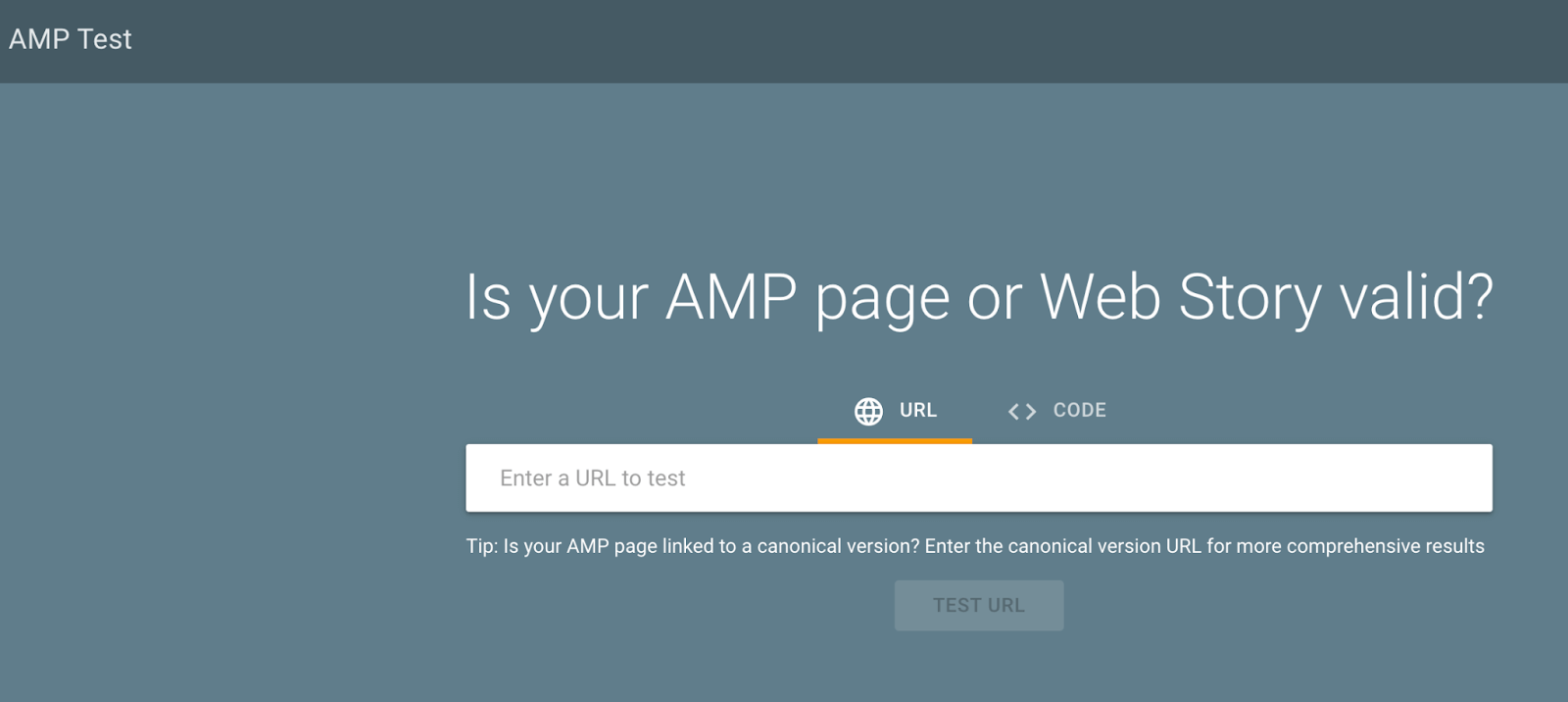
- Create accelerated mobile pages (AMP) by following the Google guidelines for AMP pages. Your AMP page links to the non-AMP version of the page via a canonical tag. Once done, you can use the AMP Test Tool to ensure that your page meets the Google Search requirements for a valid AMP HTML document.
- Use proper alt-text for all your site images, as it helps disabled users. It also helps search engines to understand the contents of the image. Also, ensure your images are below 1 MB. For every accessibility improvement, you get an SEO boost.
8- Perform Regular Testing
You should continuously test your website to identify any crucial loops that need fixing.
When you conduct regular website tests, you can work on improving your website performance with time.
You can also use split testing to determine which website changes will improve UX and help your website rank at the top of the search.
With split testing, you simply create two versions of a web page and show both to users. A/B Split testing gives timely feedback on what most users want to see from your website.
When you perform split testing, you can spot-check your website for any issues that are dragging your website behind. After seeing the split test result, you can make all the important changes on your website and see if it helps to improve your user experience.
Make your design consistent right from the landing pages. You want to be more careful with the fonts, colours, and themes you choose for your website. The more consistent and original you are on your website, the better your UX for your visitors.
Sometimes enhancing UX on your website may be challenging at the first attempt. If you are unsure what to do to improve your website ranking, you can hire an expert in this field to work on your website.
When you implement an effective UX design for your website, you can see user engagement and feedback changes, which can influence your website ranking, customer retention, and brand credibility.
Summary: What are the Best Practices for SEO and UX?
When managing a website, SEO and UX are the two most essential factors you should consider.
By focusing on UX and SEO, you can improve your website ranking on a search engine, increase traffic, and convert most users.
Here is a summary of the best practices for UX and SEO:
- Choose a website design that improves navigation.
- Use headers to make your content scannable and easy to navigate.
- Have a responsive website to make your site mobile-friendly.
- Add relevant internal and external links to reduce bounce rate and improve time on site.
- Write longer content, at least 2,000 words. Always ensure your content is original and relevant to your target audience.
- Add pictures, diagrams, statistics, and other visuals that make your content scannable and easy to digest.
- Make it easy for visitors to use your website intuitively by ensuring the homepage features are clearer.
- Create AMP pages as they are mobile-optimised versions of your site’s pages that deliver an exceptional user interface and amazing speed.
- Add proper call to action on your landing pages to persuade users to take action.
- Optimise the meta tags, including the meta descriptions, page titles, headings, and alt tags for images, to enable the search engines to understand your content better.
- Publish testimonials to establish social proof. If you want to enhance online recognition and UX, you should focus on being an authority in the industry. Customers want to know that you are legitimate before they can trust your brand.
- Make user experience a core element when developing an SEO strategy. Improve page speed, and core web vitals score to improve UX.
- Make sure to optimise the three aspects of the user experience—loading, interactivity, and visual stability. These three metrics comprise the core web vitals. You can check the core web vitals in the Google Search Console.
Final Thoughts
In this article, you have learned about some of the UX and SEO best practices you can employ to rank your website on top of SERPs.
Remember, you can help your target audience to find the information they are looking for when you employ effective UX and SEO best practices.
Make sure to test the different UX elements on your site, like the colours and text on the CTA buttons, to further improve the user experience.
Set goals and develop an SEO/UX strategy if you want to watch your organic traffic grow and convert.
