
When we set out to craft our blog posts, we often find ourselves focused on the content, striving to deliver valuable insights and engaging stories.
However, we’ve all encountered that moment when, despite our best efforts, our posts seem to lack that visual spark. We’ve been there, and we know how frustrating it can be when our well-written pieces don’t capture our readers’ attention.
Remember that formatting plays a crucial role in making our blog posts not only readable but visually appealing. By leveraging simple yet effective formatting techniques, we can transform our text into a visually engaging experience that invites our audience to stay, read, and share.
In this article, we’ll explore practical tips and tricks that will help us elevate our blog presentation, ensuring our words not only inform but also delight.
Let’s dive in and make our content shine!
Choose Complementary Color Schemes
Choosing complementary color schemes can make your blog posts visually appealing and easier to read.
When we pick the right colors, we not only draw our readers in but also guide their eyes through our content, ensuring they don’t miss out on any important points.
By establishing a clear visual hierarchy:
- We emphasize what’s most important
- We make our posts more engaging
Let’s not forget the importance of white space. It:
- Gives our eyes a break
- Makes our content feel more organized and less cluttered
A well-balanced use of white space combined with complementary colors can significantly enhance readability. Plus, it adds a touch of elegance to our blog posts.
In today’s world, responsive design is crucial. Our readers view our content on various devices, so our color scheme needs to adapt seamlessly.
By using complementary colors that work well across different screens, we:
- Ensure that our blog posts look great
- Remain accessible to everyone, no matter how they’re reading
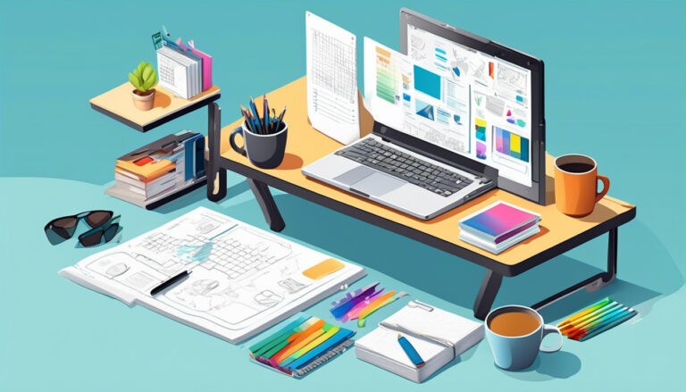
Use High-Quality Images
High-quality images can take our blog posts from good to great by capturing our readers’ attention and enhancing our content.
When we incorporate stunning, relevant images, we create a visual hierarchy that guides our readers through the post effortlessly. This approach not only makes our content more engaging but also fosters a sense of belonging among our audience, as they feel our effort to provide an enriched experience.
White space is also important. Strategically placed images can break up chunks of text, giving our readers’ eyes a rest and making the post more visually appealing. This balance helps maintain their interest and keeps them coming back for more.
Responsive design is another crucial factor. We need to ensure our images look great on any device, whether it’s a smartphone, tablet, or desktop. By doing so, we show our readers that we care about their experience, no matter how they choose to engage with our content.
Break Up Text with Headers
Headers play a crucial role in breaking up text and making our blog posts more readable and organized.
When we use headers effectively, we create a visual hierarchy that guides our readers through the content. This not only enhances readability but also helps our audience feel more connected and engaged. Seeing well-structured sections gives a sense of order and belonging, making our readers feel right at home.
Additionally, headers contribute to the overall white space of our blog posts.
By strategically placing headers, we can prevent our content from looking cluttered and overwhelming. This use of white space provides a much-needed visual break, allowing our readers to digest information more easily.
In today’s digital age, responsive design is essential.
Headers ensure that our content remains accessible and visually appealing across various devices. Whether our readers are on a desktop, tablet, or smartphone, a well-structured post with clear headers will always deliver a seamless reading experience.
Utilize Bulleted or Numbered Lists
Lists are a powerful tool to make our content more scannable and easier to digest.
By utilizing bulleted or numbered lists, we can create a clear visual hierarchy that helps our readers find key points quickly. This not only enhances readability but also makes our blog posts more engaging.
When we use lists, we introduce white space naturally.
This white space gives our content room to breathe, making it less overwhelming and more inviting. It’s like giving our readers a little break, helping them to stay focused and absorb information more efficiently.
In the age of smartphones and tablets, responsive design is crucial.
Lists adapt well to various screen sizes, ensuring our content looks great whether viewed on a desktop or a mobile device. By integrating lists, we cater to our audience’s needs, making them feel understood and valued.
So, let’s embrace lists to create blog posts that are:
- Informative
- Visually appealing
- User-friendly
Incorporate White Space Effectively
When we incorporate white space effectively, our blog posts become more readable and visually appealing.
White space, the empty or blank areas around text and images, helps to create a clean and organized layout. By strategically using white space, we can establish a visual hierarchy that guides our readers’ eyes through the content smoothly.
Let’s think of white space as the breath of fresh air that gives our words room to be noticed. It:
- Reduces clutter
- Makes our blog posts feel more inviting
We should remember that a well-spaced layout enhances responsive design, ensuring our content looks great on any device, whether it’s a smartphone, tablet, or desktop.
Moreover, white space helps to:
- Emphasize key points
- Separate different sections clearly
This way, our readers can easily navigate through our posts without feeling overwhelmed. By embracing white space, we’re not just improving aesthetics; we’re also fostering a sense of belonging and comfort for our audience.
Optimize Font Size and Type
Choosing the right font size and type can significantly enhance the readability and overall appeal of our blog posts.
We want our readers to feel comfortable and engaged, and the fonts we choose play a crucial role in achieving that.
By establishing a clear visual hierarchy, we guide our readers’ eyes naturally through the content:
- Larger headings draw attention to key points.
- A slightly smaller, easy-to-read body text keeps them absorbed.
Let’s not forget the importance of white space.
It works hand-in-hand with our font choices to create a clean and inviting layout. Adequate spacing between lines and paragraphs prevents our posts from feeling cluttered and overwhelming.
Additionally, we must consider responsive design.
Our blog should look great on any device, so choosing fonts that scale well on screens of all sizes is essential.
In essence, optimizing our font size and type helps us create a cohesive and visually appealing blog post that our readers will enjoy and appreciate.
Add Engaging Call-to-Actions
Engaging call-to-actions (CTAs) are essential for driving reader interaction and achieving our blog’s goals.
When we craft CTAs, we should place them strategically within our posts to guide readers through a clear visual hierarchy. This approach ensures our call-to-actions stand out, making it easy for readers to know exactly what to do next.
To create an inviting space, we should use ample white space around our CTAs.
This not only makes them more noticeable but also reduces visual clutter, allowing our message to shine. White space acts as a visual breather, helping our audience focus on the important actions we want them to take.
In today’s mobile-first world, responsive design is crucial.
Our CTAs must be easily accessible and visually appealing on any device, whether it’s a smartphone, tablet, or desktop. By ensuring our CTAs adapt seamlessly to different screen sizes, we enhance the user experience and foster a sense of belonging among our readers.
Ensure Consistent Formatting
To maintain professionalism and readability, we should ensure that our blog posts follow consistent formatting guidelines throughout. This consistency makes our content more inviting and easier to digest.
By maintaining a clear visual hierarchy, we guide our readers through the post, highlighting the most critical points without overwhelming them.
White space is crucial in achieving this. It prevents our content from looking cluttered and gives readers’ eyes a moment to rest. By spacing out our text and images appropriately, we create a cleaner, more appealing layout.
Additionally, we should ensure our formatting adapts seamlessly across all devices. Responsive design is essential in today’s mobile-driven world.
When our blog looks good on desktops, tablets, and smartphones, we’re ensuring that everyone feels included, no matter their preferred device.
Through consistent formatting, we foster a sense of unity and professionalism that encourages our audience to return and engage with our content regularly.
Implement Visual Hierarchy Techniques
To effectively guide our readers’ attention, let’s incorporate various visual hierarchy techniques into our blog posts. By doing so, we create a welcoming and organized space where everyone feels comfortable navigating our content.
Visual hierarchy ensures that the most important information stands out, making it easier for readers to grasp our message quickly.
One key element is utilizing white space. It prevents our pages from feeling cluttered and gives readers’ eyes a break, allowing them to focus on what truly matters.
Additionally, using headings and subheadings strategically helps structure our content, guiding readers through our posts seamlessly.
Another crucial aspect is responsive design. Our blog should look great and function well on all devices, ensuring that everyone can access and enjoy our content, regardless of the screen size.
By prioritizing:
- Visual hierarchy
- White space
- Responsive design
we create a cohesive and engaging experience for our community.
This approach makes our blog posts not only visually appealing but also more effective in conveying our message.
Utilize Blockquotes Sparingly
When we incorporate blockquotes sparingly, they emphasize key points without overwhelming our readers.
By doing so, we maintain a strong visual hierarchy that guides our audience’s eyes to the most important takeaways. Too many blockquotes can clutter the page, making it hard for readers to follow our main narrative. Instead, a well-placed blockquote can break up the text and add emphasis where needed.
In our quest to build a sense of belonging, it’s essential to use white space effectively.
White space around blockquotes creates breathing room, making our content easier to read and visually appealing. Additionally, we must consider responsive design so that our blog posts look great on any device. A blockquote that looks perfect on a desktop should also be readable on a mobile screen.
Let’s remember, it’s not just about looking good; it’s about creating an enjoyable reading experience that resonates with our community.
By using blockquotes thoughtfully, we can achieve just that.
Avoid Cluttered Designs
A cluttered design can overwhelm readers and detract from the core message of our blog post.
When we create a visually appealing blog, it’s crucial to establish a clear visual hierarchy. This helps guide our readers’ eyes to the most important information first. Let’s remember, less is more.
Incorporating white space isn’t just about making a blog look clean; it’s about offering our audience breathing room to process the content without feeling bombarded.
We should also focus on organizing our text and images in a way that makes sense and feels intuitive. By doing this, we create a welcoming environment where readers feel comfortable and engaged.
Another key aspect is ensuring our blog maintains a responsive design. This means our blog will look great and function well on any device, whether it’s a smartphone, tablet, or desktop.
By avoiding clutter, we build a space where our community can connect and thrive.
Embrace Responsive Design
In today’s digital age, we must ensure our blog adapts seamlessly to various screen sizes and devices.
Embracing responsive design isn’t just a technical necessity; it’s about making everyone feel included and valued. When we prioritize a clean, adaptable layout, we create a welcoming space for all our readers, whether they’re on a smartphone, tablet, or desktop.
We should focus on maintaining a strong visual hierarchy.
This means organizing our content so it’s easy to follow and engaging, no matter the screen size. Using headings, subheadings, and bullet points can guide our readers’ eyes and help them digest information effortlessly.
Additionally, white space is our friend.
It prevents our blog from looking cluttered and overwhelming, making it easier for our audience to read and navigate. By strategically placing white space, we enhance readability and ensure our content looks polished and professional.
Let’s commit to responsive design to create a more inclusive and visually appealing blog experience for everyone.
Test Across Different Devices
To ensure our blog looks and functions well on all platforms, we need to regularly test it across different devices. Our community values a seamless experience, whether they’re on a smartphone, tablet, or desktop.
By testing, we can confirm our responsive design adapts perfectly across various screen sizes.
We need to pay close attention to visual hierarchy. Elements like headings, images, and buttons should retain their importance, regardless of the device.
If our visual hierarchy gets disrupted, our readers might miss crucial information. Additionally, let’s ensure we’re effectively using white space to avoid clutter and enhance readability.
Testing on different devices also helps us identify any inconsistencies or issues that could disrupt the user experience. It’s about making sure everyone in our community feels included and appreciated, no matter how they choose to engage with our content.
By doing this, we can maintain a blog that’s both visually appealing and highly functional.
Seek User Feedback
To enhance our blog, we should actively seek feedback from our readers.
By inviting their opinions, we create a community where everyone feels valued and heard.
It’s essential to ask specific questions about our visual hierarchy:
- Does our use of headings and subheadings guide you smoothly through the content?
We should also inquire about our use of white space:
- Does it make the text easier to read, or does it feel too sparse?
Additionally, feedback on our responsive design is crucial:
- Does our blog look and function well across all devices, ensuring a seamless experience for everyone?
Encouraging readers to share their thoughts fosters a sense of ownership and belonging within our community.
We can use:
- Surveys
- Comment sections
- Direct emails
to gather this valuable input.
By listening and adapting based on user feedback, we not only improve our blog’s aesthetics but also strengthen our connection with our audience.


